Tuesday, June 2, 2020

Unemployment Insurance Claims Data Shed Light on the Local Economic Impacts of COVID-19 Public Health Directives

By Lyndsey Stram, Regional Economist; Lecia Parks Langston, Senior Economist


“You have power over your mind — not outside events. Realize this, and you will find strength.” Marcus Aurelius

In the wake of the COVID-19 pandemic, businesses lost revenues and workers lost jobs. But because of the time it takes to collect and collate data, economists have been left without much information to quantify the economic impacts at the local level.

But there is one ray of data illumination. Claims for unemployment benefits are promptly available and provide information about a large cross section of the economy. This post will outline what light unemployment claims data sheds on the state of the Wasatch Front South Region’s economy.

While not all workers are protected by unemployment insurance laws, roughly 95% of jobs are covered. This makes claims data an exceptional source of information about the economy. Not included under unemployment insurance laws are most self-employed workers, about half of agricultural employment, unpaid family workers, railroad personnel (covered separately) and many nonprofit organizations (such as churches). Also, some out-of-work employees may not have worked a sufficient work history to qualify for unemployment insurance benefits, but may file anyway.

Fortunately, in this time of economic distress, the social safety nets of the unemployment insurance program, special national COVID-19 funding and social programs are working together to keep workers’ income and well-being stable.

Unemployment claimants and the unemployed; they aren’t the same

Also, keep in mind that, in addition to individuals drawing unemployment benefits, the unemployment rate includes those entering and re-entering the workforce and noncovered groups without current employment. This means the number of “unemployed” will be greater than the number of claimants. In “normal” times, only about 40% of the “unemployed” are claiming benefits.

The generally reported unemployment rate also has a work-search requirement. If you haven’t made any minimal attempts to find work, you aren’t counted as “unemployed.”

Watch this Space

While this analysis won’t be updated on a regular basis, new data will be added to the data visualization on a weekly basis allowing readers to check back for the latest information.

An Unprecedented Event

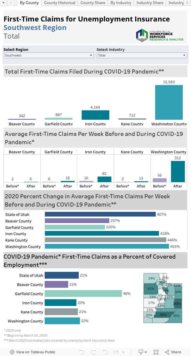
Not surprisingly, first-time claims for unemployment benefits soared in Utah and across the nation as the pandemic swept across the country. Week 12 (beginning March 16) marks the beginning of the unprecedented surge in claims. Claims in the Wasatch Front South Region peaked in week 14 and have been decreasing since. At that peak, 15,389 claims were filed between Salt Lake and Tooele Counties. By week 19, the claims are considerably lower while still remaining well above levels seen previously, even during the Great Recession of 2008-2009.

Prior to the COVID-19 pandemic, Salt Lake and Tooele Counties saw an average of 492 and 31 first-time claims per week. In the weeks since the restrictions, those numbers skyrocketed to 8,270 average weekly claims for Salt Lake and 387 in Tooele. This is an increase of 1,580% and 1,133% respectively.

Who took the hardest hit?

While Salt Lake has certainly had the lion’s share of the claims by number in the region, a much larger percent of Tooele’s covered employees have filed claims. Roughly 18% of the covered workforce has filed a claim in Tooele County, while 9% have in Salt Lake. As Salt Lake is the employment center for much of the state, it’s not surprising that a smaller portion has been affected here.

Tourism and COVID-19

In the Wasatch Front South Region, 20% of the post-COVID-19 initial claims filed corresponded to workers from the accommodations and food services industries. In addition, the true effect of the pandemic on this industry is masked by a large number of claims classified as industry “unknown” in the early days of the claims flood. Undoubtedly, many of these claims would rightfully be classified in accommodations/food services if the appropriate information were available.

Other high-claims industries include arts/entertainment/recreation, retail trade and healthcare and social assistance (reflecting the cessation of elective procedures and visits).

The Industry Flow

While most of the high-claims industries felt the pain of restrictions early on, other industries surged in later weeks. As the economic effects of other closures worked their way through the economy both manufacturing and transportation/warehousing proved relative latecomers to the layoffs in Salt Lake and Tooele.

The High and the Low

While accommodations and food services had the largest number of claims in Salt Lake and Tooele Counties, other industries have seen similar shares of claims, in percentage terms. Arts/entertainment/recreation had a first time claims rate of 20% of its covered workforce, equal to that of the accommodations/food services sector.

Sectors that had lower than average shares of claims include mining, construction, manufacturing, wholesale trade, utilities, information, finance and insurance, professional scientific and technical services, management, education and public administration.

County by County

Salt Lake County
Prior to the COVID-19 pandemic, Salt Lake County averaged 492 first-time claims per week. During the pandemic, this increased 1,580% to 8,270 weekly claims.
Salt Lake County has a diverse economy and some of the weaker hit sectors have served to buoy those hardest hit.
New claims, as a percent of covered employment, measured at 9% — in the mid-range when compared to other Utah counties.
Accommodations/food services and retail trade accounted for the largest shares of claims in Salt Lake County.

Tooele County
Prior to the COVID-19 pandemic, there was an average of 31 claims per week. During the pandemic, this increased 1,133%, to 387 average weekly claims.
New claims, as a percent of covered employment, measured at 18%. This is one of the highest rates in the state.
Unknown industries accounted for 373 claims out of Tooele County, corresponding to a sizeable 13% of the claims in the county.
Other large shares of the initial claims in Tooele come from administrative support/waste management/remediation, healthcare/social assistance, manufacturing and professional scientific and technical services.

Monday, March 5, 2018

Utah's Seasonally Adjusted Unemployment Rates

Seasonally adjusted unemployment rates for all Utah counties have been posted online here.

Each month, these rates are posted the Monday following the Unemployment Rate Update for Utah.

For more information about seasonally adjusted rates, read a DWS analysis here.

Next update scheduled for March 26th.

Friday, March 2, 2018

Utah's Employment Situation for January 2018

Utah's Employment Situation for January 2018 has been released on the web.

Find the Current Economic Situation in its entirety here.

For charts and tables, including County Employment, go to the Employment and Unemployment page.

Next update scheduled for March 23rd, 2018.


Wednesday, February 21, 2018

Ten Years After the Great Recession...


By Mark Knold , Supervising Economist and Cory Stahle, Senior Economist

December 2017 marked 10 years since the Great Recession first cast its long shadow across the American economy. The recession officially lasted 18 months, but its consequences can still be seen across the country without having to look very hard. We have not had another recession since.

Utah was hit hard at the time, losing a larger share of jobs than the national average; but, we were fortunate to be one of the most resilient states in terms of economic rebound. There are plenty of states where the Great Recession continues to weigh upon them. Employment levels in 14 states are still not back to their pre-recession peak, and another 29 states have only grown 5.0 percent or less. As the working-age population has grown by more than 5.0 percent, the job gains nationally have not been enough to fully employ working-age labor.

Utah lost 7.0 percent employment during the recession. Since that low, employment has recovered by 18 percent. That is the second best rebound in the nation. From Utah’s pre-recession employment peak to now, Utah’s employment has increased by 9.5 percent, third best in the nation. Yet, Utah’s job growth has not been enough to absorb all of the labor force growth during that time. Utah’s unemployment rate is low, but the percent of the working-age population in the labor force is several percentage points below the pre-recession norm — telling us that potential labor is still not as fully engaged with the job market as before the recession.

As a whole, Utah has had a notable recession rebound, but those gains have not been shared equally across all regions. Just like the national profile, some areas have bounced back strong while others are still lagging behind. The state’s metropolitan areas have grown well, but many of Utah’s rural areas cannot say the same. Nine counties have employment levels below their pre-recession peaks.

In this issue of Local Insights, we profile Utah’s regional and county economies in light of the 10-year span since the Great Recession.

WASATCH FRONT SOUTH

Employment: Then and Now

As the Great Recession began in December of 2007, employment in the Wasatch Front South Region measured just over 615,000. In the months that followed, the job growth rate slowed. By October 2008, the year-to-year job change turned negative and jobs began to be lost. In total, more than 30,000 net jobs vanished in Salt Lake and Tooele counties during the recession.

While job losses occurred in nearly every industry, the largest loss was in construction. In 2007, the region’s construction employment averaged more than 43,000 jobs. By 2011, construction annual average employment fell to 30,000. Housing market volatility was the significant factor and will be discussed in more detail below.

In the 10 years since the recession began, both Wasatch Front South counties — Salt Lake and Tooele — have fully recovered and exceeded their employment level from the start of the recession. The following table shows each county’s employment base when the recession began, where each is today and the percent change in the two levels.

 Source: Department of Workforce Services, BLS

Despite recovery across all industries, the region’s construction employment still remains below pre-recession levels — 37,600 jobs in 2016. As mentioned, construction employment is tied, in part, to an area’s housing market. To better understand this connection, we now look at the housing market in context of the Great Recession.

Housing Market: Then and Now

In analyzing the Great Recession, many economists and pundits point to the housing market as one of the downturn’s significant drivers. John Weinberg, of the Federal Reserve Bank of Richmond, in 2013 observed: “The housing sector led not only the financial crisis, but also the downturn in broader economic activity…the decline…was modest at first, but it steepened sharply in the fall of 2008 as stresses in financial markets reached their climax.”

Why does the housing market impact economic activity so broadly?

One way is through construction permitting activity. As population grows and demand for homes is high, additional construction takes place. The result is more jobs and more construction workers who spend their paychecks on goods and services in the community, which may create other jobs. This ripple effect also works in reverse. As construction workers are laid-off, less money is spent in the community and other jobs may be lost.

The aforementioned construction employment decline stemmed, in part, from a significant drop in residential construction permitting. Between 2007 and 2008, single-family home permits issued dropped by 57 percent and have remained lower than pre-recession levels since (see table below). Other construction also fell during the recession, particularly non-residential activity. In 2007, $253 million was invested in building banks, offices and other professional buildings in Salt Lake County. In 2009, only $66 million was invested.

Wasatch Front South Single-Family Home Permits: 2005 - 2017

Source: Kem C. Gardner Ivory-Boyer Construction Database

In addition to the number of homes being built, the housing market also impacted the economy prior to the recession due to home financing (mortgages) being sold to investors. Instead of making their mortgage payments to a bank, homeowners’ essentially paid investors. This practice tied the housing market to the whole economy and worked well when homeowners paid their mortgages. Unfortunately, many individuals purchased homes they couldn’t afford3, which led to non-payment and disastrous consequences for banks and investors. For a more detailed explanation of the role mortgage speculation played in the Great Recession read John Weinberg’s full 2013 article.
A significant increase in home prices developed as the demand for houses increased and mortgages became readily available. According to John Weinberg (2013), between 1998 and 2006, U.S. average home prices doubled. Then, in 2007, the number of mortgage non-payments (defaults) began to rise and a ripple was sent through the entire economy — effectively dropping housing prices. This home price rise and fall was also evident in Utah. The state and Wasatch Front South saw home prices rise and fall by a percent significantly greater than the United States as illustrated in the graph below.


 Source: Federal Housing Finance Agency (FHFA)


Following a 10.5 percent home price drop through January 2010, Wasatch Front South home prices began to recover. Before returning to positive territory, the change in home prices again dipped in 2011. However, since the second quarter of 2012, the region’s home prices have steadily increased. According to the U.S. Census Bureau’s American Community Survey, Salt Lake County’s median home value was $220,000 in 2012. The most recent data shows a median home value of $274,000 for 2016.

Wasatch Front South Region: Then and Now

While there are many variables that could be discussed following the Great Recession, the two we have looked at — employment and housing — illustrate the recession’s impact and subsequent recovery in the Wasatch Front South area. Despite significant recessionary job losses and home price declines, the region has recovered and surpassed many pre-recession metrics.

Endnotes:
1. 12-month moving average December 2007.
2. 12-month moving average June 2017
3. Fueled by sub-prime or other introductory mortgage rates that masked actual homeowner affordability.

Wednesday, October 25, 2017

Economic Hurdles in Rural Utah

by Mark Knold

Utah is a geographically large state. Based on total area, it is the 13th largest state, implying there is room to spread out. Despite all this space, Utah’s population distribution is quite concentrated. According to the U.S. Census Bureau, Utah is the nation’s 9th most urbanized state. This dichotomy has shaped a state with two economic profiles — one urban, one rural. It can be challenging for a state dominated and prospering within the urban to extend its economic bounty to the betterment of the rural.

What is rural? It depends upon one’s objective behind the question. Most define rural by a visual scan of the landscape. A lot of open land and not many people — rural. Yet economically, the view can be different. An area may look rural, but if the economic vitality of its populace is strongly integrated with a nearby urban area, then this creates a different perspective. The latter is a preference of the federal government — an entity that often makes allocation or distribution decisions based upon economic factors.


No matter how one technically defines rural, the Governor’s Office recognizes a recent dichotomy in Utah’s economic prosperity. Since the Great Recession, Utah has had compelling economic success. Yet, most of this is concentrated in Utah’s urban centers. Portions of Utah’s rural communities are not seeing matching levels of success. Utah’s Lt. Governor recently observed, “Not all of Utah’s communities are full participants in this economic success. Many counties off the Wasatch Front are experiencing challenges.”

In response to this economic disparity, the Governor’s Office has launched the 25k Jobs initiative — an effort for businesses to create 25,000 new jobs in 25 Utah counties by 2020. With this spotlight on rural Utah’s economics, let’s take a look at some of these rural challenges.

To most, jobs deliver their income and means for living sustenance. Therefore, employment, and peripheral variables associated with employment, becomes the strongest proxy for measuring the Utah economy’s health. We will look at Utah’s counties through the lens of employment, unemployment, the labor force and how the industry structure speaks to the underlying performance of these variables.

A profile of job growth becomes a starting point. Economic performance needs to be viewed with a somewhat long lens. The Governor’s 25k Jobs initiative was not born from a short-term disorder, but instead is recognition of weak longer-term fundamentals. To illustrate this perspective, one needs to backdrop the short-term mechanics against the longer-term dynamics.

The County Job Profile chart is an intersection of the short-term trend with the moderate-term. Each county is a bubble, and the bubble size reflects job counts. The chart is divided into four quadrants. The quadrants tell the story of the intersection of the short and moderate-term trends (growth or contraction) and the general health of the county’s economy.


There are two axes of measure. First, the vertical axis represents the short-term. It is the percentage of county job change between 2015 and 2016. Above the horizontal axis is growth — below is contraction.

Second, the horizontal axis measures the moderate-term. It is the percentage of job change over the past five years (2011-2016). To the right of the vertical axis is growth — to the left is contraction. Where a bubble lies is the intersection of the short and the moderate term.

To illustrate, find Beaver County on the chart. Beaver aligns with around -4.0 percent on the vertical axis, and 8.0 percent on the horizontal axis. This says that over the past five years, Beaver County’s job count has grown by 8.0 percent, but over the past year it has contracted by around 4.0 percent. This implies that Beaver County’s economy may be slipping a bit. A one-year view would imply a problem. A longer-term view places this short-term setback against a broader perspective of overall prosperity.

The quadrant of concern is the Contracting quadrant. These economies have contracted over both the most recent year and the past five years. No matter how one wants to define rural as outlined above, all of these contracting counties identify as rural.

In-county jobs alone are not the complete picture. For example, a large percentage of Morgan County’s residents commute to Weber or Davis counties for work. If jobs are not being germinated in Morgan County, the county and its population can still prosper from its ties with the urban area.

An additional way to look at the economy is through the lens of the labor force. The labor force consists of those 16-years and older who are either working or looking for work. It is based upon where people live, not where they work. A worker living in Morgan County will be represented in Morgan County on the following chart (County Labor Force Change); yet, if they work in Weber County, their job is represented in Weber County on the prior chart. Adding this perspective helps to round out a county’s profile.

The structure of the County Labor Force Change graphic is the same as the prior chart. The area of vibrancy is the upper-right quadrant where the labor force is increasing. The quadrant of labor force contraction is the lower left. A decline in the labor force occurs when people become discouraged and leave the labor force — yet stay in the county, or when people leave the county altogether. Either way, a decline in the labor force signals a fundamental negative in the economic trend.

Depending upon the variables measured, a gain in one and a decline in another can both be positive. Job growth and an unemployment decline are both positive. To associate the positive with low unemployment, the quadrant message on the Unemployment Rate chart has been transposed.

Every month an unemployment rate is calculated for Utah and each of its counties. A county’s unemployment rate can be measured against the Utah statewide average unemployment rate. In the following graphic, county rates are mathematically compared against the statewide rate (seasonally adjusted), recorded and then summed across time.

For example, if a county’s unemployment rate is 5.5 percent and the statewide rate is 4.0 percent, then that county’s difference for that month is 1.5. If a county’s rate were to be 3.5 percent against the statewide rate of 4.0 percent, then the difference is -0.5. These monthly differences are tallied and summed. A high score speaks to a consistent and persistent unemployment rate above the statewide average. In other words, these are counties with a continuous environment of high unemployment.

The horizontal axis is a measure since 2000 and the vertical axis a measure since the beginning of the Great Recession (2008). The axis intersection is not at zero to isolate the “concern area” within the upper right quadrant. The statewide average is consistently close to the Salt Lake County average, so a sizeable number of counties will have sums slightly above the statewide average; yet, this doesn’t imply an unemployment problem. But the non-zero intersection is utilized to emphasize the counties that do have an outstanding unemployment disparity.

Across these various charts, a common group of rural counties emerge in the weak quadrant. These include Carbon, Emery, Garfield, Piute and San Juan counties; with Duchesne and Uintah hanging on the edge. There is a common theme that surrounds this grouping and it centers upon low economic diversity.

An economy’s ability to be consistently positive has a strong foundation in a diverse mix of industrial employment. Think of it in terms of “not putting all your eggs in one basket.” Economic diversity is spreading jobs across many baskets. Diversity is desirable because the overall economy is not dominantly influenced by one or a handful of industries whose poor performance weighs upon the whole.

A Hachman Index is an evaluation tool measuring to what degree an economy may or may not have all its eggs in one basket. In the Hachman Index, a measure of 1.0 means your eggs are well distributed across many industries. Conversely, numbers approaching zero point to a high concentration in one or a handful of industries.


Many of the counties that score low on the previous charts are the same ones on the lowest tier of the following Hachman Index chart. This chart represents the placement of economic diversity upon employment change of the past five years. A county will be placed high or low (vertical axis) on the chart depending upon its Hachman Index score. It will align right or left (horizontal axis) depending upon its five-year employment change. Metropolitan counties have higher economic diversity than rural counties — placing them higher on the chart. They are also further to the right on the chart, showing stronger employment growth. There can be individual exceptions, but the general theme is that lack of economic diversity is a foundational impediment to economic viability. Industrial diversity, though difficult to artificially induce, is a desired remedy to counter sluggish economic performance.

Lack of diversity does not mandate a poor economy. A reproduction of this chart five years ago would have placed Uintah and Duchesne counties still low on the chart, but their five-year growth rates would have been off the chart, needing arrows to point out beyond the chosen 40 percent horizontal axis limit.

Those economies are dominated by energy production. When energy prices are high, their economies can soar. When energy falters, they often do likewise. They are striking examples of economic outcome being determined by a dominant industry.

In summary, there is a dichotomy within the Utah economy between urban and rural. The urban economies are diverse and, therefore, more economically balanced; while many rural economies are not. With some rural counties the economic distinction is not a wide divide; but in the rural counties where the divide is pronounced, the underlying theme is often a low level of economic performance.

Thursday, July 27, 2017

Retail Employment in the Age of Amazon:
A Profile of the Wasatch Front South Region

By Mark Knold, Supervising Economist and Cory Stahle, Regional Economist

Consumer spending makes up around 68 percent of the nation’s gross domestic product. Consumer spending is individuals and families purchasing groceries, clothing, recreation, stocks, insurance, education and much more. The transactions cover a broad swath of economic activity.

Much of the nation’s consumer spending is captured via retail trade. A useful retail trade definition is “the re-sale (sale without transformation) of new and used goods to the general public, for personal or household consumption or utilization.” Not all consumer spending is captured through retail trade transactions, but a large share is.

Whereas in the past nearly all retail transactions were done through traditional brick-and-mortar stores, now a significant and growing segment is diverted to internet sales. The consumer shops online and FedEx (or like) delivers the product. One can see that the number of brick-and-mortar stores and the level of local sales across the country are being endangered by this economic evolution.

The brick-and-mortar reduction is beginning to show its economic presence in the United States employment numbers. While the U.S. economy is finally expanding at a healthy pace this side of the Great Recession, one of the few industries not rising with this tide is retail trade. While overall retail sales are increasing, employment is not.

Traditionally, as a population increases, retail trade employment grows simultaneously, since population growth and consumer spending volume is an integrated dynamic. If studied deeply, a certain ratio of retail trade employment growth spawned from population growth would emerge. Before the internet, the vast majority of all consumer sales occurred in the immediate community or region. But now, the internet is diverting these sales away from the local community — and with internet sales growing, its market share will increase.

We do not yet know how much brick-and-mortar erosion will eventually occur. And will such a phenomenon hit some areas more than others (e.g., urban vs. rural, or local vs. tourist spending)? These are touch points that economists will be watching as this internet sales phenomenon continues to grow within the national and Utah economies.

In light of this change, in this quarter’s Local Insights we are profiling retail trade employment throughout Utah’s local regions. This can offer a profile of where retail trade is now in a local economy, and possibly how much of the sector could become vulnerable to the internet-sales phenomenon.

All regions can be viewed through the Local Insights web portal. The following is a retail trade profile for the Wasatch Front South region:

Measuring Retail – NAICS Codes

In order to explore the relationship between internet and brick-and-mortar retail we need to look at data grouped through the North American Industry Classification System (NAICS), which “is the standard used by Federal statistical agencies in classifying business establishments.” Stated simply, the NAICS groups businesses together based upon what they do.

Hierarchical in nature, the NAICS begins with a broad categorization and narrows its focus at subsector levels. As an example, the educational services sector includes all institutions focused on providing instruction and training. At the subsector levels, that focus is narrowed so that data from elementary schools, colleges and trade institutions are separated.

In the case of retail, a broad sector known as retail trade includes several underlying categories such as: motor vehicle sales, furniture stores, electronics stores, building material stores, grocery stores, pharmacies, gas stations, clothing stores and department stores, among others.

Then there is the relatively new and emerging part of the retail trade sphere — non-store retailers. These are establishments that sell products primarily on the internet or through direct selling. Examples include Amazon, Overstock.com, Young Living and dōTERRA. These types of retailers have grown rapidly in the past 15 years and their presence is reshaping the retail trade landscape. We will look at this subsector in a later section.

Retail in the Wasatch Front South

In 2016, retail trade accounted for 10.5 percent of employment in Salt Lake County making it the second largest industry with more than 72,000 jobs. In Tooele, retail is nearly 12 percent of the nonfarm workforce and is the largest industry with 1,900 jobs. The three largest retail subsectors in the Wasatch Front South are general merchandise stores, food and beverage stores, and motor vehicle and part dealers. These three account for 45 percent of retail employment in the area and are responsible for nearly a third of all taxable sales in the two counties.

This and other data are represented in the visual below, which illustrates trends in retail employment and taxable sales between 2000 and 2016. From this visual we see that retails’ share of employment has declined in recent years. On the surface, this may indicate that the internet is replacing “vulnerable” brick-and-mortar jobs with employment in electronic shopping related industries.


While many of these online retail jobs are counted in non-store retailers, some worksites may be placed in other industries like transportation and warehousing. As an example, despite their online storefront, the distribution center for Backcountry.com in West Valley City is classified as a warehousing establishment. This structural difference between online and traditional retail may account for some of the employment share reduction, but to what extent is it driven by the internet supplanting vulnerable retail locations?

Infrastructure, Perishability and Behavior – Identifying Vulnerable Retail Sectors

One way to identify potential vulnerabilities in brick-and-mortar retail employment is to explore trends in e-commerce sales relative to total retail sales. While this data is unavailable at the region and state level it is provided for the U.S. Despite the lack of geographical specificity in the data, it captures trends and relationships in an industry where borders are disappearing due to the growing accessibility of the internet.

In order to identify vulnerable employment, we will identify subsectors which have been impacted most by online shopping. We can do this by looking at internet sales penetration within retail, which is the share of online sales for a particular subsector, and comparing it to employment in Salt Lake and Tooele counties. For this portion of the analysis, we will exclude non-store retailers and look at “traditional” brick-and-mortar retail groupings and their online sales.

Wasatch Front South Employment vs. Internet Sales Penetration
 
          Source: Census Bureau Retail E-Stats


This graph illustrates four main points about the connection/competition between brick-and-mortar and online stores.

First, not all industries are currently well-suited for internet sales and may lack the infrastructure required. This is seen primarily in the low online sales levels in general merchandise (one-stop shopping) and food/beverage (grocery) stores. While the idea of having all your groceries and toiletries shipped is appealing, the infrastructure to transfer these perishable goods to a large amount of households in a timely manner does not yet exist. Conversely, the electronics subsector appears to be much better suited for online sales. Perhaps it is because individuals purchasing technology are comfortable with using technology to purchase it.

The second insight we can glean from the graph is the impact of product on labor needs. A food and beverage store will require more employees to care for perishable goods relative to a furniture store where products rotate only a few times annually. Books, clothing and electronics are also examples of products requiring less labor to maintain. Therefore, the less maintenance an inventory requires, the higher the likelihood that it will transition to online sales.

Third, the motor vehicle and part dealer subsector is unique. While perishability of goods can explain the need for higher employment levels in the grocery groupings, a car doesn’t expire the way a gallon of milk does. While some of the higher employment in motor vehicles may be explained by a lack of infrastructure in shipping cars purchased online, it may be more of a behavioral driver. According to a 2015 Autotrader survey, 88 percent of consumers said they wouldn’t buy a car before a test drive.

These first three points illustrate that infrastructure, perishability and behavior all influence the degree to which certain retail groups sell online.
The final point is the negative relationship between internet sales penetration and employment. In general, higher levels of internet sales penetration are correlated to low regional employment in that industry. This confirms visually that jobs gained with online retailers reduce employment among traditional retail.

What About Non-Store Retailers?

As mentioned previously, the graph above excluded non-store retailers. In the Wasatch Front South area, this subsector employs more than 8,000 individuals, making it the fourth largest retail category. Since 2000, employment in this subsector has grown by 126 percent and taxable sales have grown by 66 percent. So why are non-store taxable sales gaining at a slower pace than employment?

This is primarily due to the fact that sales taxes are collected by the state of the purchaser, and then, only if the seller has a physical presence in that state. This means that when Overstock.com sells a rug to someone outside of Utah, there is money coming into Utah (in terms of the jobs that the sale supports), but there is no sales tax coming in to Utah. The only non-store sales taxes captured in Utah are Utah consumers purchasing goods from retailers with a presence in Utah. Since a large share of sales by local online retailers are to customers in other states, it means that sales tax revenue lags compared to employment growth in the industry.

This example illustrates one of the greatest difficulties in quantifying the impact of non-store retailers on brick-and-mortar locations. When Utah residents purchase tax-free goods from a non-store retailer like Amazon, whose sales are not broken out by NAICS subsectors (i.e., electronics, motor vehicle parts, and home furnishings), establishing a relationship between non-store and traditional retail is challenging.

Perhaps the state’s recent agreement with Amazon will be helpful in unraveling this puzzle. Amazon recently established a nexus with the state of Utah and therefore became obligated to collect sales taxes. Amazon reportedly captured 33 percent of all U.S. online purchases in 2015, according to the magazine Internet Retailer, up from 25 percent in 2012. In response to this development, revenue estimators for Salt Lake County have added a half percentage point to their estimate for 2017 sales tax collections.