Showing posts with label Economist--Lecia Langston. Show all posts

Tuesday, June 2, 2020

Unemployment Insurance Claims Data Shed Light on the Local Economic Impacts of COVID-19 Public Health Directives

By Lyndsey Stram, Regional Economist; Lecia Parks Langston, Senior Economist


“You have power over your mind — not outside events. Realize this, and you will find strength.” Marcus Aurelius

In the wake of the COVID-19 pandemic, businesses lost revenues and workers lost jobs. But because of the time it takes to collect and collate data, economists have been left without much information to quantify the economic impacts at the local level.

But there is one ray of data illumination. Claims for unemployment benefits are promptly available and provide information about a large cross section of the economy. This post will outline what light unemployment claims data sheds on the state of the Wasatch Front South Region’s economy.

While not all workers are protected by unemployment insurance laws, roughly 95% of jobs are covered. This makes claims data an exceptional source of information about the economy. Not included under unemployment insurance laws are most self-employed workers, about half of agricultural employment, unpaid family workers, railroad personnel (covered separately) and many nonprofit organizations (such as churches). Also, some out-of-work employees may not have worked a sufficient work history to qualify for unemployment insurance benefits, but may file anyway.

Fortunately, in this time of economic distress, the social safety nets of the unemployment insurance program, special national COVID-19 funding and social programs are working together to keep workers’ income and well-being stable.

Unemployment claimants and the unemployed; they aren’t the same

Also, keep in mind that, in addition to individuals drawing unemployment benefits, the unemployment rate includes those entering and re-entering the workforce and noncovered groups without current employment. This means the number of “unemployed” will be greater than the number of claimants. In “normal” times, only about 40% of the “unemployed” are claiming benefits.

The generally reported unemployment rate also has a work-search requirement. If you haven’t made any minimal attempts to find work, you aren’t counted as “unemployed.”

Watch this Space

While this analysis won’t be updated on a regular basis, new data will be added to the data visualization on a weekly basis allowing readers to check back for the latest information.

An Unprecedented Event

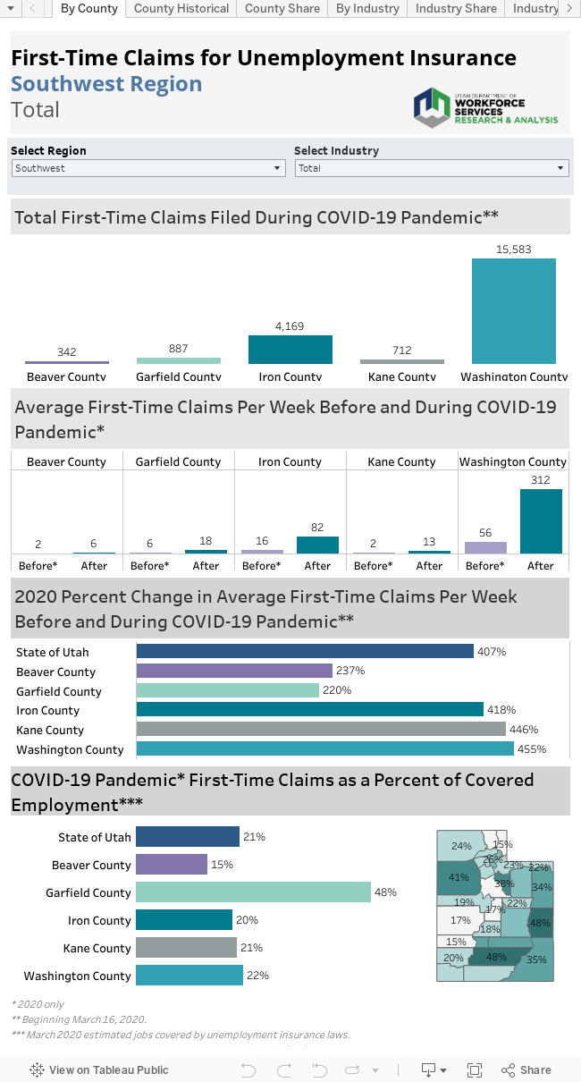
Not surprisingly, first-time claims for unemployment benefits soared in Utah and across the nation as the pandemic swept across the country. Week 12 (beginning March 16) marks the beginning of the unprecedented surge in claims. Claims in the Wasatch Front South Region peaked in week 14 and have been decreasing since. At that peak, 15,389 claims were filed between Salt Lake and Tooele Counties. By week 19, the claims are considerably lower while still remaining well above levels seen previously, even during the Great Recession of 2008-2009.

Prior to the COVID-19 pandemic, Salt Lake and Tooele Counties saw an average of 492 and 31 first-time claims per week. In the weeks since the restrictions, those numbers skyrocketed to 8,270 average weekly claims for Salt Lake and 387 in Tooele. This is an increase of 1,580% and 1,133% respectively.

Who took the hardest hit?

While Salt Lake has certainly had the lion’s share of the claims by number in the region, a much larger percent of Tooele’s covered employees have filed claims. Roughly 18% of the covered workforce has filed a claim in Tooele County, while 9% have in Salt Lake. As Salt Lake is the employment center for much of the state, it’s not surprising that a smaller portion has been affected here.

Tourism and COVID-19

In the Wasatch Front South Region, 20% of the post-COVID-19 initial claims filed corresponded to workers from the accommodations and food services industries. In addition, the true effect of the pandemic on this industry is masked by a large number of claims classified as industry “unknown” in the early days of the claims flood. Undoubtedly, many of these claims would rightfully be classified in accommodations/food services if the appropriate information were available.

Other high-claims industries include arts/entertainment/recreation, retail trade and healthcare and social assistance (reflecting the cessation of elective procedures and visits).

The Industry Flow

While most of the high-claims industries felt the pain of restrictions early on, other industries surged in later weeks. As the economic effects of other closures worked their way through the economy both manufacturing and transportation/warehousing proved relative latecomers to the layoffs in Salt Lake and Tooele.

The High and the Low

While accommodations and food services had the largest number of claims in Salt Lake and Tooele Counties, other industries have seen similar shares of claims, in percentage terms. Arts/entertainment/recreation had a first time claims rate of 20% of its covered workforce, equal to that of the accommodations/food services sector.

Sectors that had lower than average shares of claims include mining, construction, manufacturing, wholesale trade, utilities, information, finance and insurance, professional scientific and technical services, management, education and public administration.

County by County

Salt Lake County
• Prior to the COVID-19 pandemic, Salt Lake County averaged 492 first-time claims per week. During the pandemic, this increased 1,580% to 8,270 weekly claims.
• Salt Lake County has a diverse economy and some of the weaker hit sectors have served to buoy those hardest hit.
• New claims, as a percent of covered employment, measured at 9% — in the mid-range when compared to other Utah counties.
• Accommodations/food services and retail trade accounted for the largest shares of claims in Salt Lake County.

Tooele County
• Prior to the COVID-19 pandemic, there was an average of 31 claims per week. During the pandemic, this increased 1,133%, to 387 average weekly claims.
• New claims, as a percent of covered employment, measured at 18%. This is one of the highest rates in the state.
• Unknown industries accounted for 373 claims out of Tooele County, corresponding to a sizeable 13% of the claims in the county.
• Other large shares of the initial claims in Tooele come from administrative support/waste management/remediation, healthcare/social assistance, manufacturing and professional scientific and technical services.

Monday, May 1, 2017

Census Bureau Tool Provides Labor-Force Insight for Utah

By Mark Knold and Cory Stahle


Across the United States, jobs are quantified through each state’s unemployment insurance program. Those programs provide the potential for laid-off workers to receive unemployment benefits — the goal being to bridge the gap between workers’ lost jobs and their next jobs. An eligible recipient’s weekly benefit amount is based upon their earnings from recent work. This begs the question, how does Utah’s unemployment insurance program know how much an individual recently earned while working?

That answer is supplied by all businesses that hire workers, as they must report their employees and pay as mandated by the unemployment insurance laws. Companies identify their individual workers and those workers’ monetary earnings for a calendar quarter. As businesses are identified by their industrial activity and geographic location, it is through the unemployment insurance program that aggregate employment counts by industry and location are calculated.

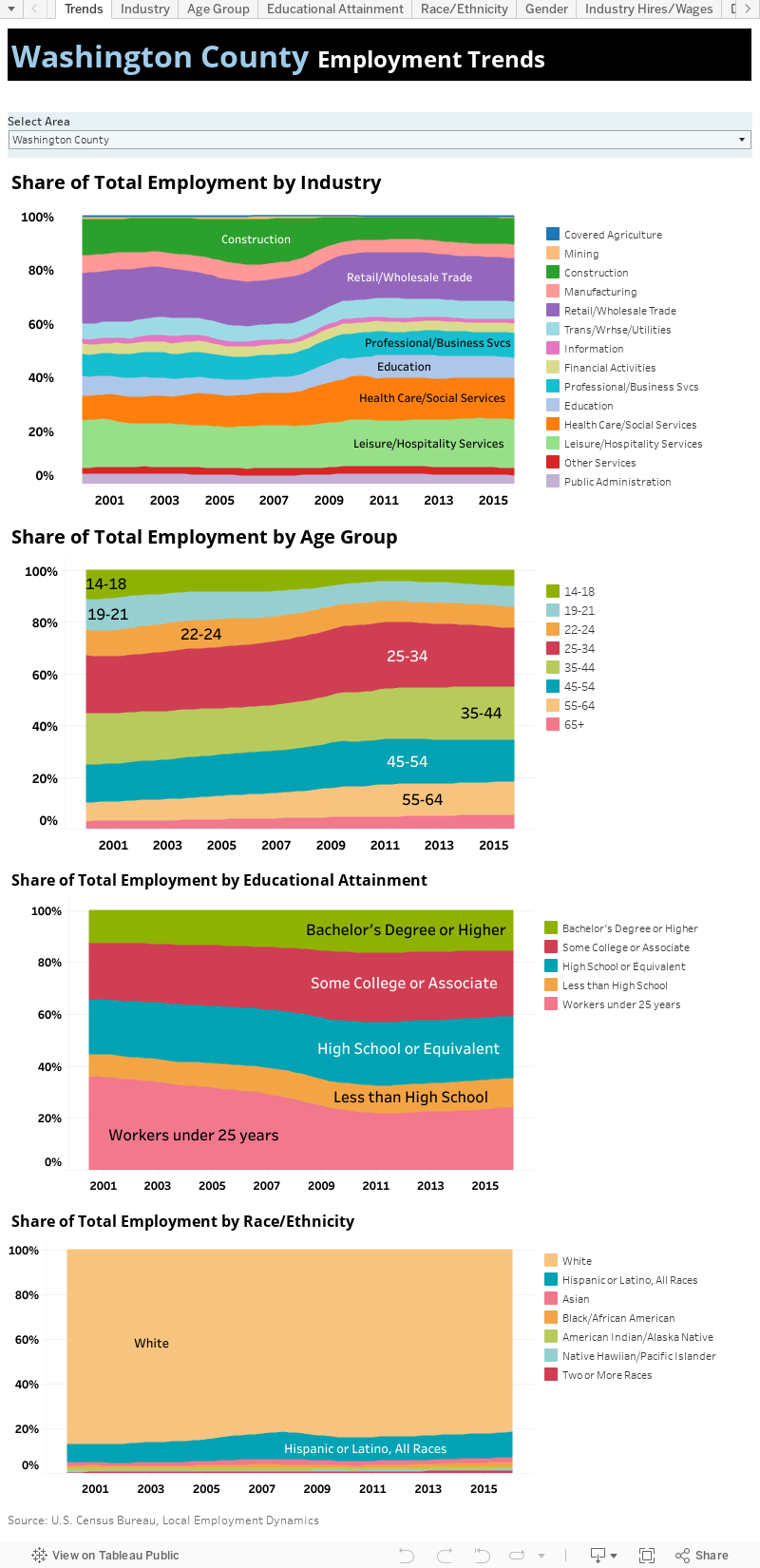
Yet each state’s profiling of individuals is quite minimal in the unemployment insurance program. The U.S. Census Bureau can bring more light to the overall labor force by supplementing said information with gender, age, race/ethnicity and educational attainment (imputted from American Community Survey responses) for Utah’s labor force.

The Census Bureau packages this information through their Local Employment Dynamics program and makes available said data on its website. Here at the Department of Workforce Services, we recently downloaded and packaged Utah-specific data from said website and summarized it in the attached visualization.


Friday, February 28, 2014

Wednesday, September 18, 2013

MSA Gross Domestic Product estimates released

The U.S. Bureau of Economic Analysis just released 2012 Gross Domestic Product (GDP) estimates for Metropolitan Statistical Areas (MSAs) in the United States. On average, MSA real GDP (adjusted for inflation) increased by 2.5 percent in 2012—slightly lower than the total U.S. average of 2.8 percent.

Nationally, Texas and Indiana dominated the rankings for the fastest-growing MSAs. Each of these states placed three MSAs among the top ten. The New Orleans and San Francisco MSAs showed the fastest-growing large MSA economies.

In Utah, only the Logan UT-ID MSA experienced below-average expansion (up only 1 percent. The Provo-Orem MSA produced the highest percent change—4.5 percent and ranked 32nd nationally. The St. George MSA recovered from GDP contraction in 2010 to show a healthy 3.2 percent gain in 2012. For more information about this data release, click here.

Monday, February 25, 2013

2011 Advance GDP by Metropolitan Area Released

The U.S. Bureau of Economic Analysis recently released gross domestic product estimates for the nation’s 366 metropolitan areas. In 2011, metropolitan area growth registered an average of 1.6 percent—just slightly higher than the U.S. total (1.5 percent). However, the growth rate for metro areas dropped noticeably from the 2010 expansion of 3.1 percent.

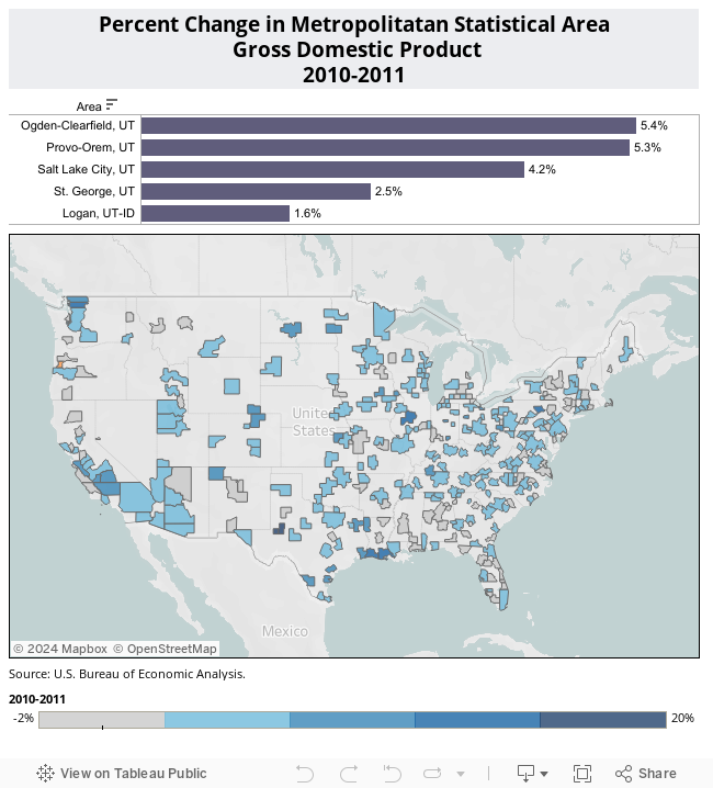
Only 242 of the nation’s metropolitan areas experienced a 2011 gain in GDP. However, all of Utah’s metro area’s showed increases equal to or greater than the U.S. metro average. Both Ogden/Clearfield and Provo/Orem generated gains of greater than 5 percent. Lowest on the scale proved the Logan metro area with a gain of only 1.6 percent. For more information on the current release, click here.

Monday, March 12, 2012

Foreclosure Rates

I've had a couple of questions lately about where to find foreclosure rates by county. Without paying for information, county-level foreclosure rates are hard to find and when you can find them, the numbers are old (HUD foreclosure rates, 2008; New York Federal Reserve Bank, Third Quarter 2010). Some private entities (such as Realty Trac) publish limited free foreclosure information. However, they don't publish their methodology and an analysis of their figures suggest they may leave something to be desired.

However, for Metropolitan Statistical Areas (MSAs), I have found what looks to be some decent free and relatively up-to-date foreclosure data. This analysis of LPS Applied Analytics Data by the Local Initiatives Support Corporation (LISC) is well documented and on-going. And, their methodology is available so the data-user can understand the data itself. You can access their data by clicking here.

I've also thrown together some visualizations of their foreclosure data below. First some definitions:

Foreclosure Rate: Percent of all mortgages in the foreclosure inventory in the reference month.  Mortgages in the foreclosure inventory include those in foreclosure and bankruptcy foreclosures prior to auction or trustee sale.

Prime Foreclosure Rate: Percent of all prime mortgages in the foreclosure inventory in the reference month.  Prime mortgages are those that are Grade A, not a government product or government-insured, and either with 1) credit scores over 720 or 2) credit scores are from 680-719 with full documentation.

Subprime Foreclosure Rate: Percent of all subprime mortgages in the foreclosure inventory in the reference month. Subprime mortgages are those that a servicer coded as subprime or loans made to borrowers with FICO scores below 620 who did not receive a government, Fannie Mae or Freddie Mac loan.

Serious Delinquency Rate: Percent of all mortgages either 90 or more days delinquent or in the foreclosure inventory in the reference month.

90+ Delinquency Rate: Percent of all mortgages 90 or more days delinquent and have not yet entered into judicial or non-judicial foreclosure in the reference month.

Not surprisingly, Utah's poster child for the housing bubble, the St. George, UT MSA (Washington County), shows the rates for most worst measures. On the other hand, it still ranks far below some of the worst MSAs (many in Florida and also nearby Las Vegas). In June 2011, Washington County's foreclosure rate ranking measured 146 and its serious delinquency rate measured 130. The Salt Lake City MSA showed the next Utah highest rankings, while the Logan, UT-ID MSA showed the lowest foreclosure rankings. Hmmm. . .Utah MSAs with the most bubble-like increases in home prices (see the previous post) also show the highest foreclosure rates. While the MSA in Utah with the smallest home-price acceleration during the boom (Logan, UT-ID MSA) shows the lowest foreclosure ranking in Utah. Coincidence? I think not.

You'll also notice that all the Utah MSAs show a decline in serious delinquency rates since the national peak in foreclosures in December 2009. In this case, the St. George, UT MSA has shown the most improvement.


Tuesday, January 31, 2012

Provo women earn some of the lowest salaries in the largest U.S. Metropolitan Areas

Women in Provo have some of the lowest average salaries in the country, according to a Forbes analysis of the 2010 American Community Survey by the U.S. Census Bureau. Provo women are making on average less than $37,000 a year, according to the report. Provo women are making on average less than $37,000 a year, according to the report. Deseret News

Note:
Since I am interested in women's labor force issues and don't usually look at this type of data below the statewide level, I took the opportunity to look at the actual Forbes article. Forbes  used 2010 American Community Survey data for "large" Metropolitan Statistical Areas (MSAs) and focused on females working year-round and full-time. Unfortunately for comparative purposes, Forbes doesn't tell us what they considered a large MSA.

With median female earnings for year-round, full-time workers of $31,400, the Provo/Orem MSA ranks 249 out of 374 MSAs nationwide. Incidentally, the "smaller" MSAs of Logan and St. George showed lower female median earnings ($27,100 and $26,700, respectively). Other large Utah MSAs appear higher in the rankings--Salt Lake ranks 154, while the Ogden/Clearfield MSA ranks in the 200 spot.

However, keep in mind that areas with low female earnings might also have low earnings for both genders. In other words, an MSA's low female earnings may be reflected in low male earnings as well. Cost of living, age of the labor force, industrial mix, etc. affects wages generally. . .not just for women. In my mind, the true question perhaps should be: How do men and women's earnings compare in Utah's most populous communities?

In 2010, U.S. median earnings for women working year-round, full-time measured 78.6 percent of the comparable male figure. (This wage gap has contracted decidedly in recent decades.) How do Utah's MSAs stack up? Honestly, not so great. The Ogden/Clearfield MSA shows a female/male wage ratio of 63 percent, the Provo/Orem MSA shows 65 percent ratio. Logan's ratio measures 70 percent, and St. George's figure is 71 percent. Even in Utah's best MSA performer--Salt Lake City--the female median wage measures only 74 percent of the male median wage. More than 70 percent of the nation's MSAs show female/male wage ratios better than Salt Lake City.

What's up? Why the low female-to-male wage rations in Utah? Undoubtedly many factors come into play. However, one major influence on the large difference in wages seems to come to the forefront. I call it the "education gap" and it is a primary factor behind Utah's larger-than-average wage gap. Statistically, there is a well-know relationship behind one's earnings and one's education. In general, the higher a person's level of education, the higher their earnings.

What's the education gap? By my reckoning, it is simply the percentage point difference between the share of the male population (over 25) with at least a Bachelor's degree and the share of the female population (over 25) with at least a Bachelor's degree. Nationally, there is a six-tenths of a point difference in the share of men and women with at least a Bachelor's degree (28.5 percent and 27.9 percent, respectively). In other words, in the U.S. there is currently very little difference between the share of men and women with a four-year degree or better.

The three MSAs with the largest male/female education gap in the nation? Number 1--Provo/Orem, Utah (11.3 percentage points). Neck and Neck for the number 2 spot--St. George, Utah (9.8 percentage points) and Ogden/Clearfield, UT (9.8 percentage points). Logan's performance is somewhat better--"only" a 4.2 point difference. The Salt Lake MSA managed the smallest Utah education gap--still large at 2.5 percentage points. Every single Utah MSA ranked among the 20 percent of MSAs with the largest education gaps.

Keep in mind that in 40 percent of the nation's Metropolitan Statistical Areas, a higher percentage of women have obtained a Bachelor's degree than have men. If Utah's women are falling far behind men in educational attainment, it should come as no surprise that they are falling far behind men in earnings.


Tuesday, September 13, 2011

Most of Utah's Metropolitan Statistical Areas experience GDP growth in 2010

The U.S. Bureau of Economic Analysis just released annual Gross Domestic Product (GDP) estimates for Metropolitan Statistical Areas (MSAs) today. Remember that GDP represents the value of all goods and services produced in an area. Real (inflation-adjusted) U.S. GDP for metropolitan area increased an average 2.5 percent in 2010 after declining 2.5 percent in 2009. Growth proved widespread with real  GDP increasing in 304 of 366 (83 percent) metropolitan areas, led by national growth in durable-goods manufacturing, trade, and financial activities.

In Utah, growth also dominated the figures with only the St. George, UT MSA displaying an annual decline in real GDP (down 1.6 percent). In general, GDP growth in Utah's MSAs registered below average. The Logan UT, MSA showed the most rapid expansion (4.0 percent).

For more information about the 2010 GDP figures for MSAs, click here.

Wednesday, July 20, 2011

Utah’s June hotel numbers flat

Hotel occupancy rates were barely better than a year ago, rising 1.4 percent statewide and 1.1 percent in Salt Lake County. Offsetting those minimal increases were average room rates that declined about $1 a night in Utah as a whole, and $2 nightly in Salt Lake County. Cedar City provided the primary exception to these unimpressive statistics. Lodging establishments there filled 69 percent of their rooms last month, up from 61 percent a year earlier, according to the Denver-based Rocky Mountain Lodging Report. Salt Lake Tribune

Wednesday, March 30, 2011

Has Utah's housing bubble deflated yet?


Housing bubbles aren't like most price bubbles. Typically, speculation drives up prices (of stocks, crude oil, and back in the 17th century even tulips) like an expanding bubble. Eventually, it becomes obvious that item is extremely over-valued and prices "pop" and collapse. Yes, that's why we call them bubbles.

Remember a couple of years ago when gasoline prices went through the roof? You can blame a bubble market in crude oil. (Some SEC reports indicated that 80 percent of crude oil trading during the height of that price expansion was speculative.) In just seven months, the producer price index (seasonally adjusted) for crude oil went from 339.9 to 108.8. That change represents a decrease of almost 70 percent! Talk about a popping bubble. (And, you might want to note the similarity to the current price increases in oil/gasoline.)

On the other hand, housing bubbles tend to slowly deflate rather than pop. Why? Think about it. If you bought a home at the height of the bubble for $400,000 do you really want to sell it for $250,000? No. Most private individuals aren't able to afford that kind of loss. For many American families, a home is their largest asset. So, if you must sell, you will keep trying to sell at a higher price until the market makes it clear that just isn't going to happen. In other words, home prices are sticky downward, so it will take longer for home prices to deflate after the speculation ends.

It also becomes readily apparent why there is such a foreclosure mess in this country. Obviously, many home-buyers took out loans they couldn't afford in the long run. Then, the recession exacerbated other home-buyers' ability to pay. In addition, even if home-buyers can afford to make their payments, aren't the incentives skewed towards walking away rather than paying off the $400,000 mortgage on a home that is now worth only $250,000?

Well, this housing bubble has certainly taken its time collapsing. However, the market is working her magic and there does seem to be light at the end of the tunnel--at least according to the Federal Housing Finance Agency's Housing Price Index (HPI). (For more information on the HPI see this previous post or the Agency's website.)

(Click on image to enlarge.)

The chart that accompanies this posting certainly provides a lovely portrait of a housing market bubble for Utah's Metropolitan Statistical Areas (MSAs)--particularly for my own Washington County. You can watch home prices explode and then collapse (the chart shows the percent change compared with the same quarter a year ago--which eliminates seasonality).

The Logan, UT MSA (Cache County) seemed to participate the least in the run up of home prices and also appears closest to the end of the price declines. As of fourth quarter 2010 (the most recent index available):

  • Logan home prices are down only 1.0 percent compared with prices in fourth quarter 2009.
  • Ogden-Clearfield MSA home prices are down 1.8 percent.
  • Salt Lake City MSA prices are down 2.0 percent.
  • Provo-Orem MSA prices are down 2.4 percent.
  • St. George MSA prices still show the largest price declines--4.8 percent.
However, for all MSA the price declines are getting smaller and smaller. The market is making her adjustments. In fact, given current trends, most if not all of Utah's MSAs are poised to see the end of home price declines in 2011.

Wednesday, February 23, 2011

Metropolitan GDP figures released


The U.S. Bureau of Economic Analysis (BEA) has just released 2009 estimates of Gross Domestic Product for Metropolitan Statistical Areas (MSAs) across the nation. (Yes, that's not a "typo" 2009 data is the most recent information available for MSAs.) Given the economic downturn, it may be surprising that only 80 percent (292 of 366) of the nation's MSAs experienced a decline in real (inflation-adjusted) gross domestic product.

How did Utah's MSAs perform? Three of five Utah MSAs showed an increase in gross domestic product in 2009--Logan, Salt Lake City, and Ogden-Clearfield. In fact, the Salt Lake City MSA (which includes Salt Lake, Tooele, and Summit counties) placed in the top quintile of all MSAs. The gains weren't phenomenal (just under 1 percent), but during a recession, any gains are certainly welcome.

The St. George, UT MSA (Washington County) produced the worst Utah decline in GDP during 2009--3.4 percent. Of course, the St. George area participated in housing market speculation to a much greater degree than any other area in the state. Indeed, Washington County's decrease placed it in the lowest quintile of all MSAs. It's performance ranking? It ranked 310 out of 366 MSAs. In addition, Provo-Orem experienced a 1.7 percent drop.

For more information on recent GDP performance: http://www.bea.gov/newsreleases/regional/gdp_metro/gdp_metro_newsrelease.htm

Home prices hit post-bust lows in most big cities

Home prices in a majority of major U.S. cities tracked by a private trade group have fallen to their lowest levels since the housing bubble burst. The Standard & Poor’s/Case-Shiller index fell in December from November in all but one of the 20 cities it tracks. The 20-city index declined 1 percent.

The only market to see a gain was Washington, D.C. Along Utah’s Wasatch Front, according to a Jan. 27 report, the residential real estate market, mired in one of the worst downturns ever, is showing a few signs of improvement.

In Salt Lake County, 1,934 existing single-family homes were sold in the fourth quarter of 2010, down 21 percent compared with the fourth quarter of 2009, according to the Salt Lake Board of Realtors. The median selling price was $215,000, down 4.4 percent from the same three-month period in 2009 and off a peak of $256,000 in the summer of 2007. Salt Lake Tribune

Note: The Federal Housing Finance Agency also publishes the Housing Price Index for all Metropolitan Statistical Areas (MSAs). The following chart shows the year-to-year change in the index for Utah MSAs. The most current index is for third quarter 2010. A bottom to housing prices according to this chart would occur when the year-to-year is equal to zero. At this point, the Logan, UT MSA is closest to a bottoming in prices, followed by the Ogden-Clearfield MSA. Not surprisingly, these two areas experienced the lowest level of speculation in the housing market. You can access this information at: http://www.fhfa.gov/Default.aspx?Page=14

Wednesday, December 22, 2010

9 Utah solar energy projects receive Blue Sky money

Rocky Mountain Power's Blue Sky program is helping fund the construction of nine community-based renewable energy projects in the state. Overall, more than $938,000 was awarded for 12 projects in Utah, Wyoming and Idaho, including 11 solar projects and one wind project. The funding is made possible through participating Blue Sky customers, who number more than 34,000. Deseret News

Tuesday, December 7, 2010

Housing Price Index--one measure of housing price movement

Every quarter, the Federal Housing Finance Agency publishes the Housing Price Index (HPI) for the U.S., Census divisions, states, Metropolitan Statistical Areas (MSAs) and houses not in MSAs. The HPI is a broad measure of the movement of single-family house prices.  It is a weighted index that measures average price changes in repeat sales or refinancings on the same properties. This information is obtained by reviewing repeat mortgage transactions on single-family properties whose mortgages have been purchased or securitized by Fannie Mae or Freddie Mac since January 1975. Obviously, some properties are excluded from the "sample." However, because of the breadth of its sample, the index is more robust than other indexes which may be available.

The base of the index is 1991. So, for example, if Salt Lake City had an index of 199.96 in the second quarter of 2009 (which it did), the index indicates that average home prices had basically doubled since 1991. Tracking four-quarter changes in the index indicates whether home prices (on average are rising or falling). Overall, in the third quarter of 2010, Utah home prices were down by less than 3 percent compared to the same quarter in 2009. While that's not anything to boast about, it represents a notable improvement from the 10-percent decline two quarters earlier.

The graph that accompanies this post shows year-over changes in the HPI for Salt Lake City, Las Vegas, and St. George since 1990. Obviously, both St. George and Las Vegas markets participated more extensively in the speculation which resulted in the current housing bust than did Salt Lake City. The bigger the boom, the bigger the bust. Plus, Salt Lake came to the boom later than most and is closer to experiencing an actual increase in home prices.

However, the worst of the home price declines appear to be over in both Las Vegas and St. George and both housing markets are working to "right" themselves.

For more information on the Housing Price Index, go to: http://www.fhfa.gov

Tuesday, September 28, 2010

Census Bureau Releases American Community Survey data for 2009

The U.S Census Bureau has released the 2009 American Community Survey (ACS) 1-year estimates on American FactFinder. There you will find tables with social, demographic, housing, and economic data for areas with populations of 65,000 or more. The American Community Survey provides a wealth of demographic, social, economic and housing data. For example, here is where Utah ranks among all U.S. states and the District of Columbia in 2009.

Utah ranks:
  • Forty-ninth for the percent of households with one or more person 65 years or older.
  • Number one for the percent of households with one or more person under 18 years of age.
  • Fifty-first for the percentage of people with a disability.
  • Eighth for the percentage of people over 25 who have graduated from high school.
  • Twentieth for the percentage of people over 25 with at least a Bachelor's degree.
  • Thirty-fourth for the percent of married couples with both spouses in the labor force.
  • Forty-eighth for the percentage of children in poverty.
  • Twelfth for the percentage of children without health insurance coverage.
  • Twentieth for the percentage of the population without health insurance coverage.
  • Fifth for the percentage of homes built since 2005.
  • Twenty-first for median family income.
  • Twenty-second for the percentage of the population that is foreign born.
  • First for average household size.
  • Forty-ninth for the age of women at first marriage.
  • Forty-first for the average travel time to work.
  • Eighteenth for the percentage of the population that is white/not Hispanic.
  • Sixteenth for the divorce rate for women.

Data for 2009 are available for the state, Cache, Davis, Salt Lake, Utah, Washington, and Weber counties. Three-and five-year estimates will be available for the remaining counties in three to four month.

Click here to access the data.

Wednesday, May 26, 2010

Home prices still falling in Utah's metropolitan areas


According to information released by the Federal Housing Finance Agency, home prices have yet to bottom-out in Utah's various Metropolitan Statistical Areas. Compared to prices a year ago, St. George MSA prices are down almost 18 percent, prices in the Provo-Orem MSA are down 13 percent and the Salt Lake City MSA prices are down about 10 percent. Both the Ogden-Clearfield MSA (down 6 percent) and the Logan MSA (down 3.4 percent) show slower home price declines.

Thursday, April 22, 2010

New County-Level Personal Income Data Available

The Bureau of Economic Analysis (BEA) has released estimates of personal income at the county level for 2008 based on newly available source data. The county estimates released today complete the successively more detailed series of data releases depicting the geographic distribution of the nation’s personal income for 2008.

The annual estimates (1969-2008) of local area personal income have been revised to incorporate the comprehensive revision of the National Income and Product Accounts (NIPA). Comprehensive revisions, which are undertaken every 4 to 5 years, are an important part of BEA’s regular process for improving and modernizing its accounts to keep pace with the ever-changing U.S. economy. Bureau of Economic Analysis